2009-10-17

Helvetica

Helvetica is a feature-length independent film about typography, graphic design and global visual culture. It looks at the proliferation of one typeface (which recently celebrated its 50th birthday in 2007) as part of a larger conversation about the way type affects our lives.

i don't know it before . some good LOGO in my life. them are form Helvetica. i watch a film about Helvetica at the Visual Communication class. Helvetica make logo ,word are beautiful. i like it. i attention it. i go to internet search some information for it. i think i have a little crazy at moment:. after is Helvetica design.


do u drive jeep car?


 Helvetica design was your life.

2009-10-14

Starting Out Straight

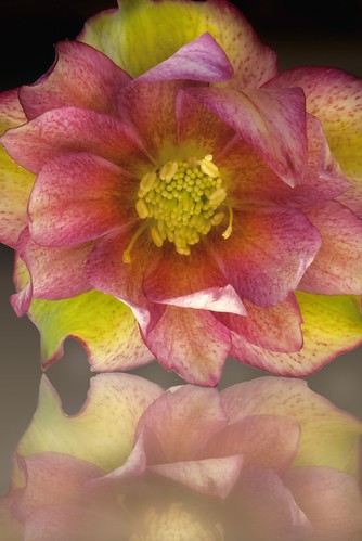
To start with, I took a straight studio shot of a rare double hellebore blossom (immediately below). The flower is one of the first blossoms from the second year blooms of these special hellebore plants, hybridized by Botanic Gardens in the dublin.I photographed the blossom using a backlighting setup on partially reflective lucite with a black background.

The capture information: 200mm f/4 macro lens (300mm in 35mm terms), 1 second at f/36 and ISO 100, tripod mounted using a Kirk Mighty Low Boy.


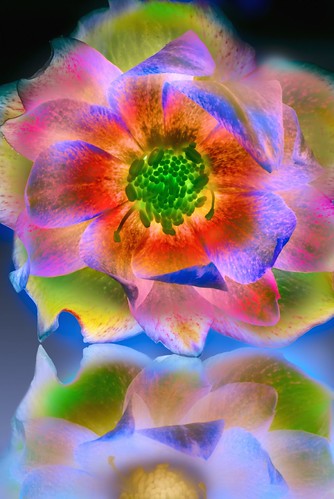
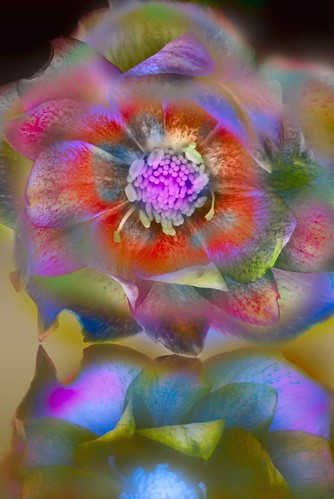
When I saw the photo on my monitor, I like the way it came out. But I definitely needed to play with the image in Photoshop (below and far below).


I often get asked about the techniques I use to get effects like these. I’ve no desire to be mysterious about it. But the precise steps I use are different every time. It’s a process, when it’s working right, that feels like the image is calling out to me, and revealing the steps as I go along necessary to reveal the inner image. You could say that I am the image’s therapist, taking the external image and revealing its inner self.


Also the case: if you tell me that you prefer my straight starting place, I won’t be offended.


There is some commonality in the techniques I usually use. I start by photographing (or scanning) for high depth-of-field and transparency. I then work on the image in Photoshop using a variety of blending modes with duplicated inversions of LAB channels.


2009-10-11

A Little Definition is Sweet

Without doubt, the most welcomed features of Aperture 2.0 are several new image adjustment features included in the program You can almost close your eyes and point them out because they’re so clearly evident. While I greatly welcome the new Lightroom-like features such as vignetting and vibrancy, when I tried out the little feature called Definition, all I could say was, sweeeet.


We all know that both Aperture and Lightroom basically make adjustments to the entire image when they are applied, but with Aperture 2.0, Apple has included Definition as a way of adding local contrast when adjusting an image. Basically it seems to add more contrast to a Contrast adjustment. While the latter affects the entire image, the Definition adjustment affects more local areas, helping to further get rid of haze in the photo.


You can see the changes when applied, but sometimes using the Loupe tool will help you see the changes even better.


Before Definition adjustment:


After Definition adjustment